


Creativity & Design
Running a web design agency isn’t just about a black and white process that you can put through an AI and get a quality design or could it be? While every creative is quick to point out the poor quality of AI in many untrained circumstances AI and creativity can be very helpful and if a quality conversion with the AI has taken place perhaps even ideas that are better than the individual using it. By the end of this article you’ll see the one thing you won’t get from the AI shining through my creative writing 😉 I do have an articles on using AI in web design if you wanted to read more on the topic.
Design is also about patterns and rules not just creativity
Does this sound like something an AI could be trained to understand? I think absolutely, it’s also quicker to do research and to analysis data so where is this “creativity” process human resulting in something of better quality? I’m not sure quality or speed are the right outcomes we should be looking for. While a design discovery process could identify something an AI can’t come up with couldn’t his same question and answer be fed into an AI and for this new nuance to bring the same value?
Strategy
This keyword get’s well and truely over utilised in the design world. There is something mystic about design as there is with IT that makes customers see value in what people do in these area’s. An agency based on IT alone though results in less of a consultation and more of a person that moves pixels around. Sorry designer, the same can be said for design even more so as most IT people are usually fairly analytical and systematic in their approach. Personally I’d trust an IT person over a designer any day with “strategy” but the difference here is a designer is used to working with content. Breaking paragraphs down or layouts, it what they do. You really need both in order to have the best chance of doing this properly. if you want to learn more about strategy in website design you can check out my other article where I talk about what not to do with strategy as well as being flexible. It’s nice to say every now and then you failed in order to learn a little bit more and share with others.
Web Design Layouts
Layouts should implement a flow of content that helps to achieve a goal, this may involve the order or emphasis of aspects of services and products that influence a particular persona and their aspirational identity. Let’s break down what patterns in design might look like and some rules that are worth considering. All of this of course can be programmed into an AI.
Sections
Sections should identify an idea or a single thought or point. These sections could be as simple as a services or products block or could be testimonials, pricing or really any range of things related to a business. There’s no set list of sections that are included on every site. That said some section ideas could be more influential than others to specific types of users.
Section Rules
Different to it’s adjacent neighbours
Each section should be separated or made appear unique in the flow to make it easier for users to read the content.
- Different background colour
- Different background image
- Spacing above and below the section
- The use of a divider or shape divider.
Headings
- “Most” sections should have a heading — This makes the content more quickly and easily identifiable.
- Some section headings, in fact most should be simple and not have as much marketing speak as what would be expected in the main hero of a page.
- Be descriptive and to the point with headings
Layouts
- What we’re after here is a clear way to take content and put it into a specific layout style. A large block of text may be best paired with an image or put into a column text setup.
- Columns — Depending on the content these could be used for all sorts of services, products or pricing layouts. I would expect a 3x or 4x style layout.
- Alternating patterns such as image and text, text and image in a 1/3 3/1 style is a nice balanced visual pattern
Avoid Layout Confusion
- Don’t mix ideas in a single section
- Having column horizontal can create confusion with design
Hierarchy
There’s a reason why a h1 is a top level first and unique heading and a h2 sits inside of that and content or images inside of each. It’s easier not only for Google to understand but also users visually if sizing and spacing also vary to these levels.
One of the fundamental issues I see all the time with SquareSpace site themes is an overuse of h1 tags on everything. This could be because the user is a DIY high school student but it’s not the case. The themes often out of the box come with non-hierarchical issues like these. Hierarchy and content here is king.
Content Order
Imagine if we called strategy “content order”, this doesn’t sound as valuable does it? You might be saying well content order is more about tactics then the overall strategy and that’s true as well but when it boils down to it a strategy could be articulated in a few sentences and still be effective. Back to order, the order of a page should be completed in a way the sections or ideas are put together to get the user to do what the designer desires them to do. Such as clicking a cta button and getting in contact.
Design Systems
Again this sounds like scary terminology that needs a designer but I see this area as a bit of a combination of areas not all of them are applicable in the solo design area. A design system you see is to unite designers working around a product or brand into one common theme and ruleset. It is also suppose to reduce “Design debt” a term I’m sure they’ve stolen from the “Tech debt” equivalent developer website builder area. There’s alot that could be said here and if you are genuinely interested then I’d recommend “Design Systems Handbook” or have a listen on audible. While I felt the term should be mentioned it’s not something for this article.
Styling Rules
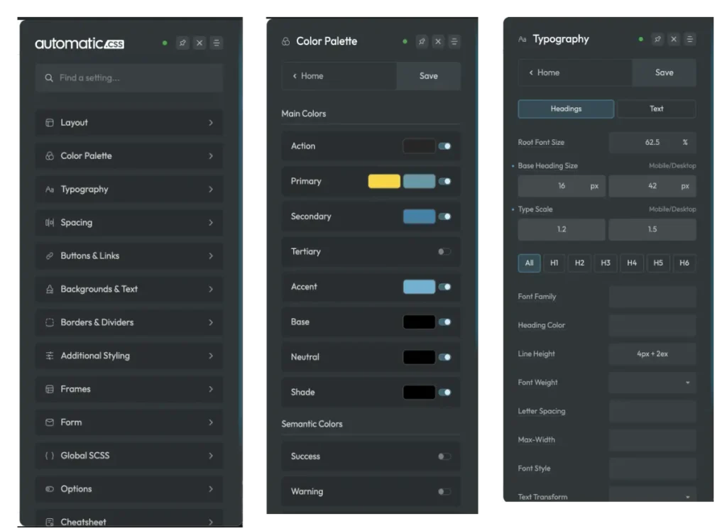
This part of the design system aligns to a large part of the website or band style guide and can now be pre-programmed globally. This is why it’s important to use a framework like ACSS with a website build because they are focused around programming in aspects of styling elements to the colours, sizes and spacing together with the variation in these between media sizes. I’m not talking about breakpoints necessarily here I’m fully against adaptive design to a size but variable sizing using variables or tokens in css together with functions like clamp and min/max enhance the end product. These last things are the real reason a developer should be building your site and not a web designer.
My ideal styling rules contain the following:
- Button sizing
- Section spacing
- Font sizing
- Button variations in borders, size and padding
- Heading and text sizing together with line height
- Colour definition between primary, secondary and others including tints.
The above definitions and global styling are not the only things that go into a design system. What I particularly like is the above does take care of a large portion of puzzle and speeds up choosing the parameter you’re after to apply to the element.
This results in variables that can be used within a builder to apply global attributes once. Better style these are applied via classes that have consistent naming conventions based on the BEM naming convention or Block Element Modifier. Best practice all the way.
If you are interested in more articles about best practice here’s a few I’ve written that could be helpful:
- Why a “designer” shouldn’t try to do it all
- Website templates are for chumps
- Professionally built website accessibility
Patterns & use of elements
With patterns and even component style design systems we talk about the same amount of spacing, the same colour and the same background in the same configuration. It’s all about consistency and keeping that consistency results in more professionalism.
Design tools won’t make you creative
Tools are becoming increasingly good at programming in design variables to keep consistency. I use Figma for all of my website layouts partner this with Frames or a component library that may also be available in your builder this results in a component style workflow that can still involve the client in a collaboration.
That leads me to collaboration, I cannot believe in 2024 designers till use PDF to get feedback from clients. How 1990s of you, while I understand print designers not wanting to train in another tool for web if they’re a print designer and not willing to pickup Figma for example then maybe don’t do design you’re not familiar with. I realise this makes me seem a little arrogant but honestly collaborating with clients around a design in Figma is quick engaging and get’s to a better product at the end of the day and helps to meet expectations and for customers to feel like they’ve contributed to “their” design. It’s “their” website not yours for your next award or your portfolio. If you’re a designer who doesn’t use a tool like figma, spend your Christmas holidays upskiling yourself and for goodness sake stay away from building websites especially in SquareSpace. Grr, the idea behind the lie that anyone can build a website.
We wind this article up and I have to say it’s all me, there’s no AI in this article at all and you can probably tell from the inconsistencies, grammer and typos but hey it’s human and their’s something that can be said for the emotion and passion that shines through.